Science tells us: more is more, and less is less. As geoscientists, we therefore intuitively conceive paragraphs of text as a lot of information, and a generous selection of colours as strongly eye-catching. But text-filled, rainbow-coloured poster presentations communicate neither effectively nor in an accessible manner.
After working for months or even years on a geoscience project, we have a lot to tell, don’t we? Our approach, our findings and conclusions; all wrapped into a nice introduction and outlook of the broader topic. To everyone’s disappointment, EGU rules only allow for one white square-meter of printable space, and not anything beyond that!
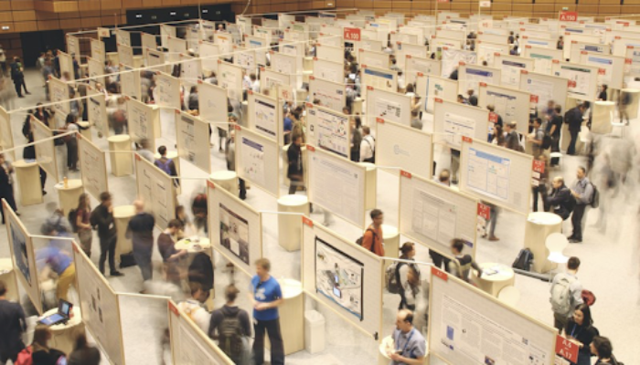
As I silently stroll past the EGU23 poster aisles, I cannot help but note what has been done well and what could have been done better. I make the following observations:
Empty space is still the geoscientist‘s undeserving enemy
Long paragraphs with too much text, complicated sets of equations and multiple weakly informative graphics tend to be favoured over the huge graphical capacity of empty space. This is not ideal as it fails to draw in the audience and keep them interested. Much worse, it loses the key messages of your research amidst “too much information.”
Science-proof colour scales are on the rise!
While five years ago, at EGU 2018, posters with bad rainbow-type colour maps made up about 60% of all presentations with colour figures (see https://betterfigures.org/2018/04/16/how-many-rainbows-at-egu-2018/), science-proof colour maps are, in most alleys, now the most common sight. Widespread colour-map misusage is only occurring in a few, individual sessions, and disciplines. A good positive step in the right direction!
Poster designs are more polarised in terms of graphical quality
It seems that posters are either designed on informed graphic principles as a whole, or they are not at all. The resulting difference is strikingly strong, and makes good poster designs stand out, and attract viewers even more.
Apart from these three observations, I get quite enthusiastic to see that common poster presentation pitfalls like missing scales, unclear typefaces, confusing visual structures, and missing citations of reused graphics are now very rare. As I shamelessly judge everyone’s poster, I realise that doing so is an excellent exercise in itself. As a viewer, think about it:
How much time do you spend on deciding whether to stop at a poster, or not? And what information is most valuable to make this decision? How much text are you willing to read, in particular when the presenter guides you through their presentation? And would you be happy to not be able to differentiate important aspects like high and low values?
Playing through this exercise, we might then hopefully all agree that an educated design approach has therefore one key message visible on first sight and is tailored to the specific audience. Mike Morrison’s ‘betterposter’ poster design allows everyone to create a poster design that communicates effectively for a big conference like #EGU23. Its generous use of empty space makes your key message accessible, even to viewers just walking by. Proper scales, like colour bars with perceptually-even and colour-vision deficiency friendly colour gradients, like the ‘Scientific colour maps’, represent your data accurately and make your effective posters also accessible to everyone who can see. By incorporating such community resources into your workflow, you can even reduce the time needed to create the poster. Other geoscience-related graphic resources like the open-access repositories EGU Imaggeo (photographs) and s-ink.org (graphics) can further simplify and speed-up poster creation.
So, why have poster designs improved compared to those five years ago? I think it is thanks to the many people who tirelessly educate and remind their peers about the do’s and don’ts of graphic design. Holding each other accountable is one of the fundamentals of academia and cannot stop at science communication. Such peer-to-peer learning is especially important in the geosciences, because scientific visualisation is not yet normally taught for geoscientists at universities. In other words, poster design failures are not prevented proactively, and therefore still have to be counteracted reactively. EGU offers special webinars informing about science-quality and inclusive graphic design and provides a platform for related short courses. As long as the geoscience community receives new uneducated members, such teaching resources remain a true necessity.
I will leave you with some of my webinar recommendations:
- How To Visualise Your Research Using Scientific, Accessible Graphics: https://youtu.be/ukldJAo6MKU
- 1 study, 4 presentations: how to share your research in any conference format! https://youtu.be/KemZK1na_Oo
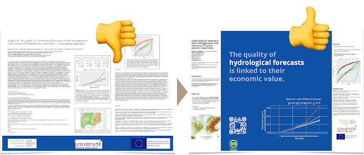
Figure: Fabio Crameri, EGU Webinar
Made-up geoscience poster examples